Baby Boy Nursery Reveal: Our Modern Nursery and Guest Room Combo
When we found out we were expecting a new baby this past Spring, so many logistics started flooding my mind. Would we all be able to fit in our car? Would the kiddos need to share bedrooms? Would we need to give up our guest room? How was this all going to work logistically?
Come Summer, we found out baby #3 was going to be a little boy. We were so excited. Had the sex been a girl, we were planning on the new baby sharing a room with Isla. With a little boy on the way, it was back to the drawing board.
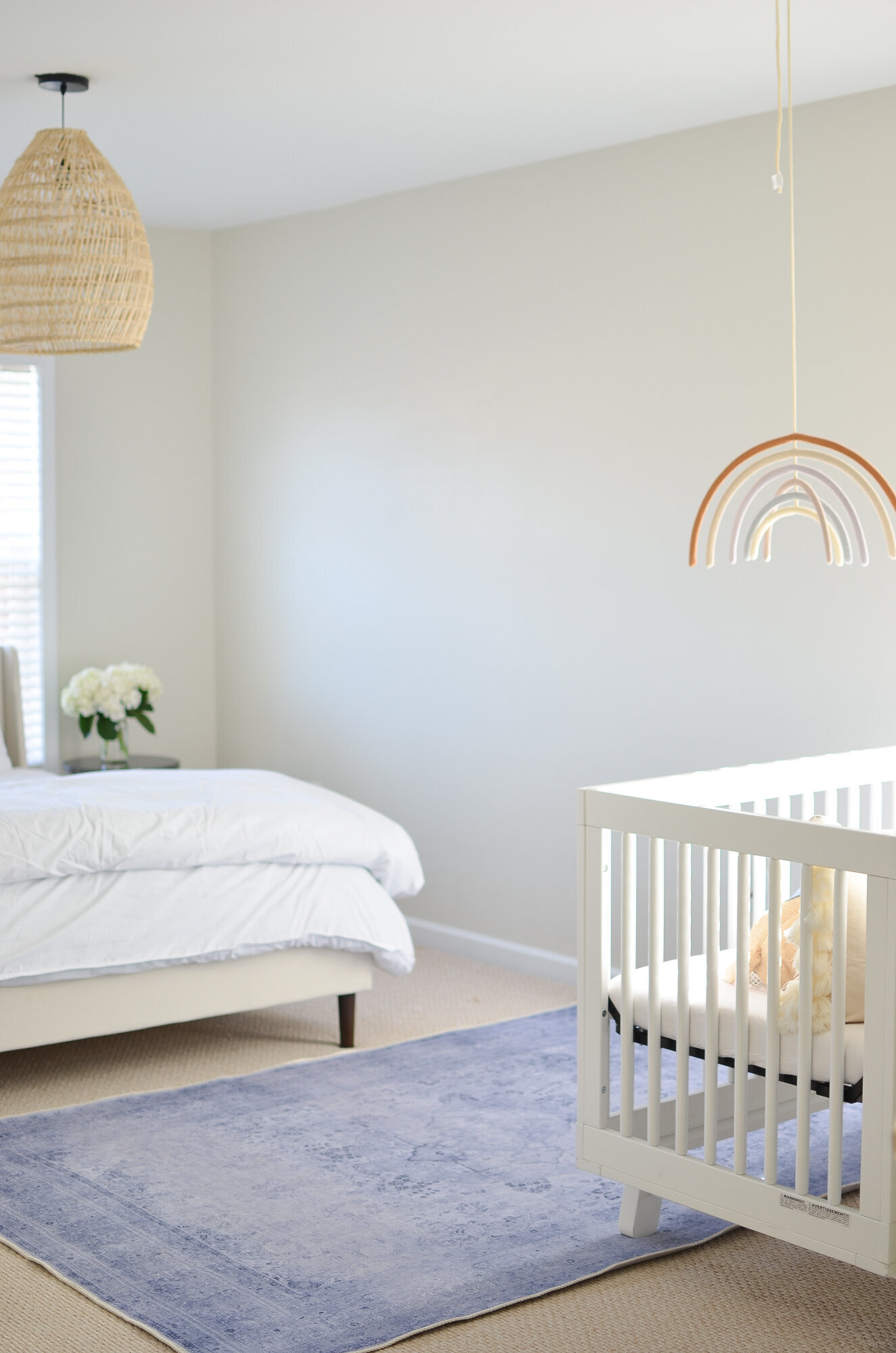
After consulting with the awesome Momma Society moms on Instagram, you all helped me realize that a nursery/guest room combo would be a great strategy. After all, we only have overnight guests a few times a year. The room was large enough that we could fit a crib and still keep the king bed we use for guests.
You May Also Be Interested In: Postpartum Essentials: My Top Picks the 3rd Time Around
When it came to designing the room, I wanted the area around the crib to still have a sweet nursery feel, but to also flow with the whole room so guests wouldn't feel like they were misplaced in a nursery.
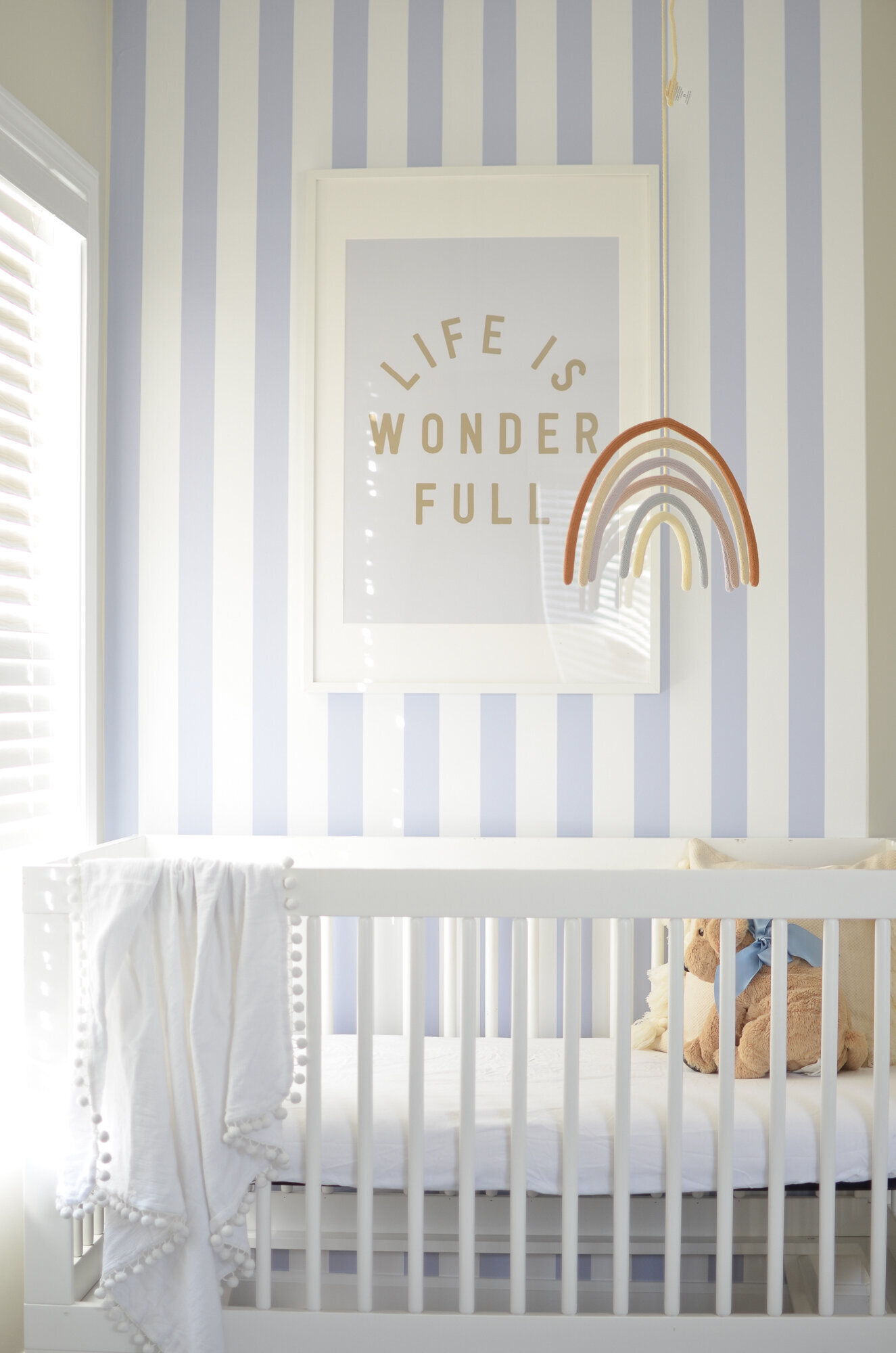
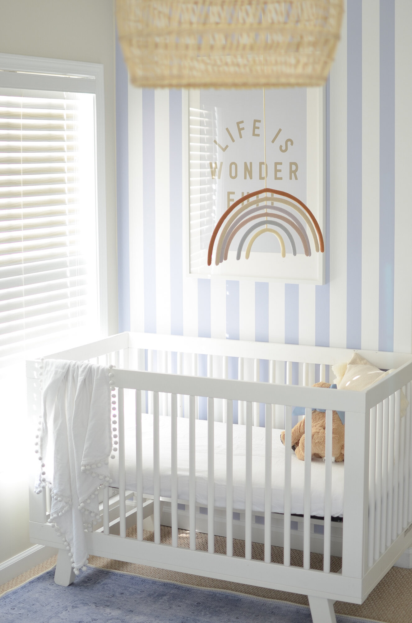
To create the nursery element, I collaborated with Muse Wallpaper to set-up the nursery nook of my dreams. A small wall + a statement wallpaper = the perfect focal point. I tested out over half a dozen wallpapers before picking my favorite. A classic blue stripe. It seemed to be the perfect paper that could be used in a nursery or a guest room.
I was a little nervous about installing the removable wallpaper---but it was so much easier than I ever expected. The key for a successful install is all in the setup. Make sure to have a really straight and smooth start and then pulled it slowly in small sections. Muse provides a little tool to smooth away any bubbles, which makes the process super easy. If you are considering installing removable wallpaper, I cannot recommend Muse enough. They sent over a ton of samples, plus some custom work for us to choose from. The directions for installation were easy to follow, and the end result is gold. I feel like the wallpaper accent walls make the nursery complete.
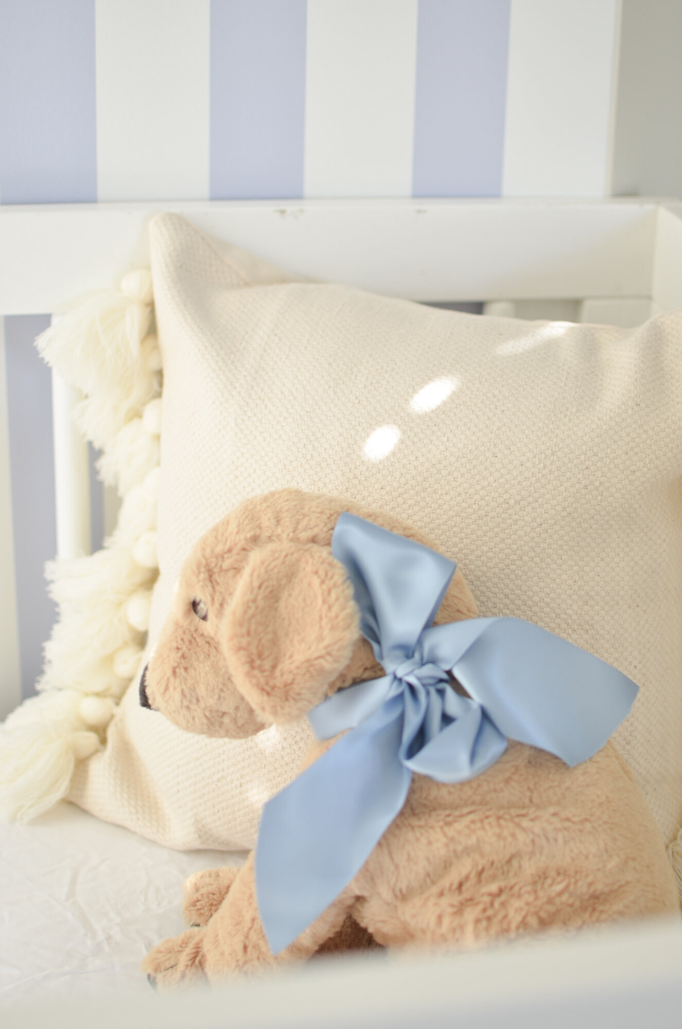
I tried to keep the rest of the nursery bedding, art, and accessories pretty minimalistic so it would flow with the guest room and let the wallpaper pop. One of my favorite details is the hanging rainbow mobile from Blabla kids. It moves ever so slightly when the air turns on and adds the perfect little magic touch.
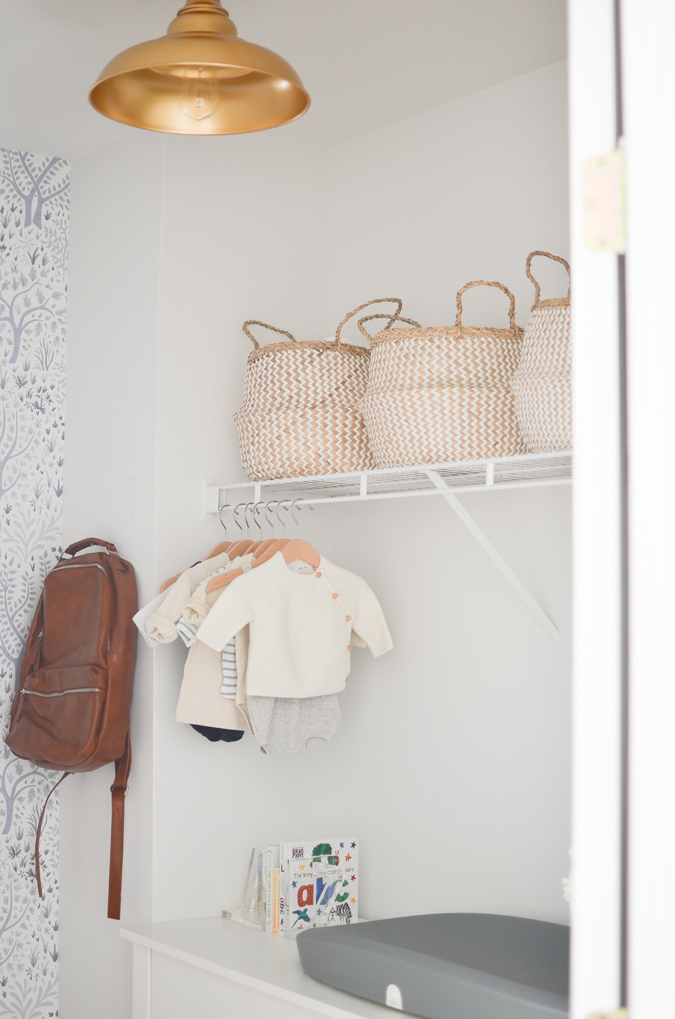
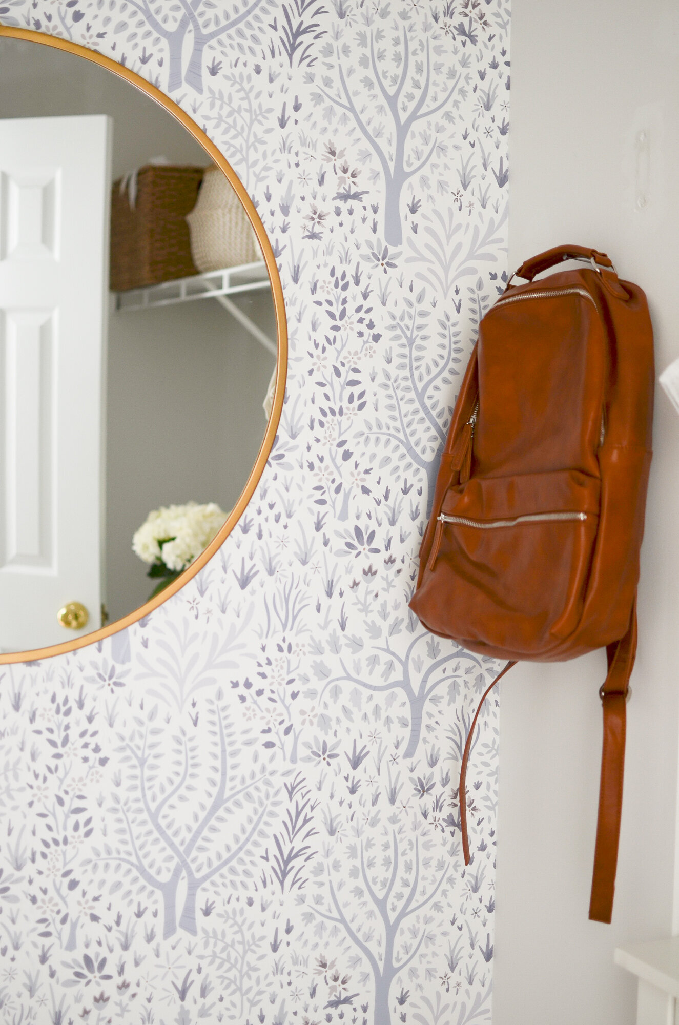
Since the room would be a bit tight if we tried to squeeze a dresser, we decided to make the closet a special little baby spot too. We used the whimsical Woodland Trees removable wallpaper from Muse for a statement wall. It is SO cute---even better in person and a style I think will transition with our little guy for years to come. The closet is dark, so we added a big mirror and a new light fixture to try to brighten it up a bit. We squeezed in the dresser against the wall (the same dresser from Isla's nursery). And added lots of baskets for storage above for swaddles, teethers, and all of that baby gear that often gets misplaced in the shuffle.
mirror // dresser // baskets // wallpaper // changing pad
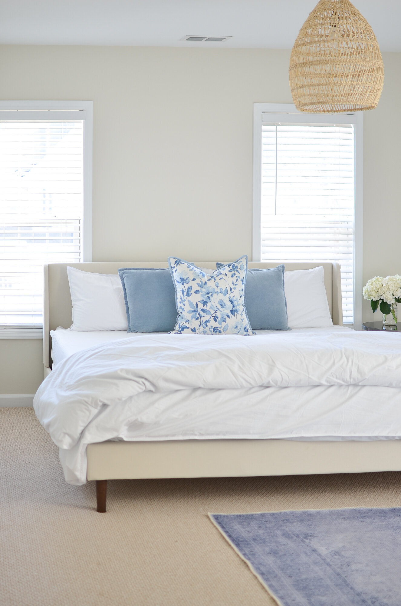
Our previous "guest bedroom" setup was quite literally just a mattress on the floor. So embarrassing! It was fun to set-up an actual bed. We kept it nice and neutral so the nursery corner would be the highlight. We bought this bed frame for a steal, added a couple of gorgeous Woven Nook pillows and some fresh new white linens. I've been sleeping in here the past few nights while JD recovers from the flu and it has such a cozy feel. I'm still on the hunt for some art, plants and nightstands, but in the meantime it will be a great spot to feed a baby in the middle of the night.
Now we sit back and anxiously await our little guy's arrival! I cannot wait to see him enjoy his little space.

